
Booking.Com
A Genius Upgrade
Task: Booking.com is looking to refresh its email design system for the first time in over ten years. They want a modern, clean look that improves readability, and aligns with its mobile-first experience.
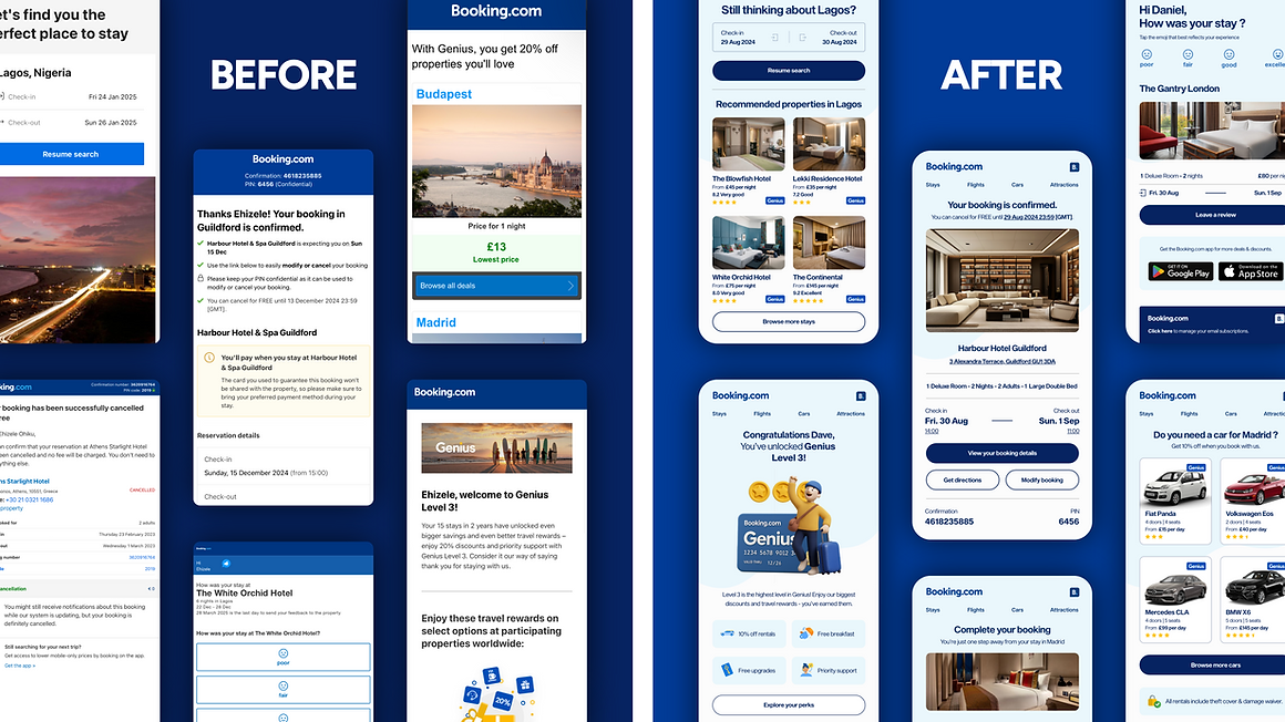
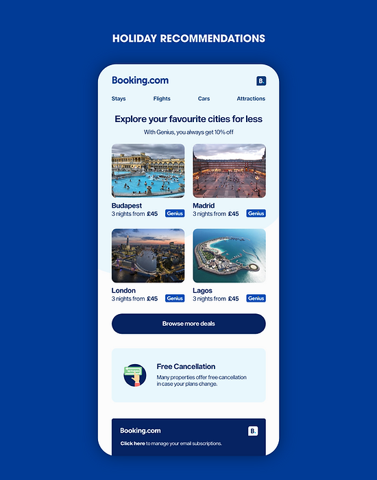
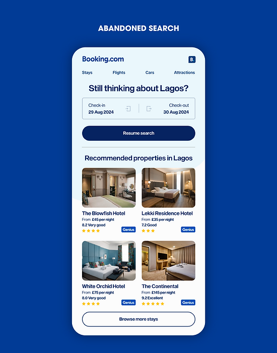
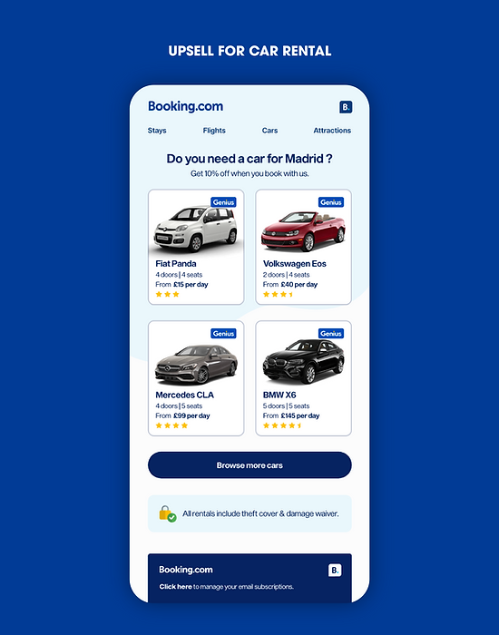
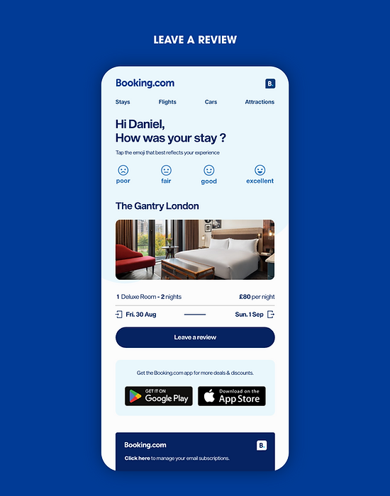
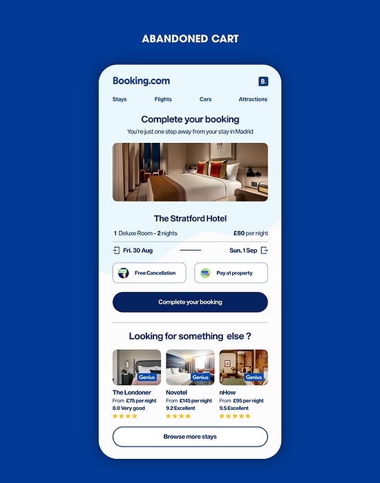
For this project, I explored multiple design directions before landing on a clean, modern system that aligns with Booking.com’s broader digital experience. The objective was to replace outdated email templates with a layout that’s mobile-first, visually consistent, and easier to navigate. I used a card-based structure with clear hierarchy, generous white space, a persistent navigation bar, and subtle gradients to make the content more scannable and user-friendly. While the redesign introduces a fresher, more elevated tone, it still stays true to Booking.com’s core brand elements. My approach treats email design with the same principles as web design—because, at its core, an email is simply a page of links leading you to other pages.

Strategy
Behind the design
Question: What is the best way to rollout the new templates without too much disruption to the Booking.com email network.
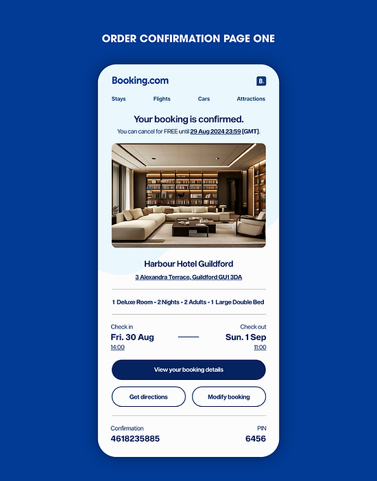
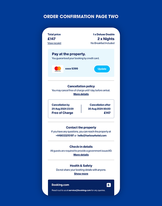
To introduce the new email design, I’d begin with a soft launch targeting around 5–10% of the user base. This initial phase would focus on high-volume, low-risk emails like booking confirmations and reminders. These are emails users are already familiar with, which make them ideal for testing design changes without disrupting key journeys. By monitoring open rates, click-throughs, heatmaps, and user feedback, we can fine-tune the design based on real behaviour before a wider rollout.
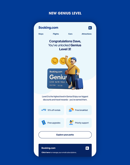
Next, I’d expand the rollout gradually by email type - starting with high-engagement categories like Genius rewards, abandoned searches, pre-trip reminders, and post-trip review requests. This phased approach allows each touchpoint to be optimised for clarity and conversion while maintaining consistency. At this stage, I’d also introduce a subtle banner or message in the footer letting users know the emails have been refreshed to improve their experience - building transparency and trust.
Once performance is validated, we’d move into full deployment across all languages, customer segments, and markets. To support consistency, the new design would be aligned with in-app visuals, Booking.com’s web UI, and even app store branding where relevant. A short in-app message or push notification would help explain the change and reinforce the value. Throughout, customer support and internal teams would be kept informed with updated style guides, fallback templates, and FAQs to ensure the transition feels seamless across the entire Booking.com ecosystem.
Next Project
